SVG Animation 【CSS編】
クリエイティブ
2017.06.05

Lyzon編集部
目次
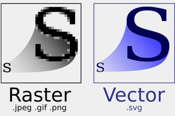
SVGとは?
出所:https://ja.wikipedia.org/wiki/Scalable_Vector_Graphics
Scalable Vector Graphics(スケーラブル・ベクター・グラフィックス、SVG)は、XMLベースの、2次元ベクターイメージ用の画像形式の1つである。アニメーションやユーザインタラクションもサポートしている。SVGの仕様はW3Cによって開発され、オープン標準として勧告されている。
ベクター画像なので画像を拡大した場合でも曲線部が滑らかで使いやすいです。
LYZONロゴ引用(SVGファイル)
↑コーポレートサイトロゴサイズ「width=102.13, height=24」
↑大きいサイズ「width=100%」
こんなに最大に拡大しても綺麗に~
早速、「LYZON」のロゴを使ってアニメーションを付けてみましょう
SVGのソースを確認
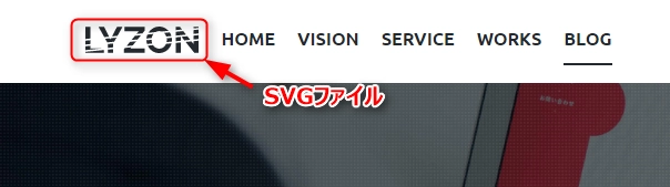
LYZONのコーポレートサイトロゴを使います。(SVGで作られています。)
マウス右クッリク「検証」でソースを確認しましょう。
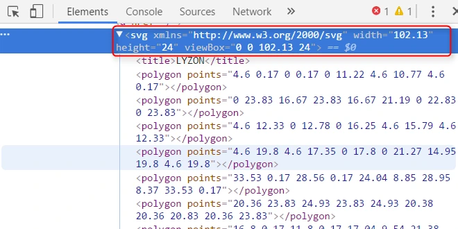
指定されたSVGコードをコーピーします
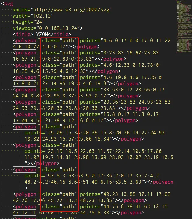
コーピーしたコードをエディタで各パスごとにclassを付けます~(class="path")
ここまで来たらもうCSS書くだけ!
Animation CSSを書く
私はCSSを下記のように簡単に書きました。
.path {
    stroke: #000;
    fill: #fff;
    stroke-width: 0.1;
    stroke-dasharray: 2100;
    animation: DASH 5s;
    -webkit-animation: DASH 5s;
    -moz-animation: DASH 5s;
    -o-animation: DASH 5s;
    animation-iteration-count: infinite;
    -webkit-animation-iteration-count: infinite;
    -moz-animation-iteration-count: infinite;
    -o-animation-iteration-count: infinite;
}
@keyframes DASH {
    0% {
        stroke-dashoffset: 2100;
        fill: #fff;
    }
    50% {
        stroke-dashoffset: 2050;
        fill: #fff;
    }
    100% {
        stroke-dashoffset: 0;
        fill: #000;
    }
}
@-webkit-keyframes DASH {
    0% {
        stroke-dashoffset: 2100;
        fill: #fff;
    }
    50% {
        stroke-dashoffset: 2050;
        fill: #fff;
    }
    100% {
        stroke-dashoffset: 0;
        fill: #000;
    }
}
@-moz-keyframes DASH {
    0% {
        stroke-dashoffset: 2100;
        fill: #fff;
    }
    50% {
        stroke-dashoffset: 2050;
        fill: #fff;
    }
    100% {
        stroke-dashoffset: 0;
        fill: #000;
    }
}
@-o-keyframes DASH {
    0% {
        stroke-dashoffset: 2100;
        fill: #fff;
    }
    50% {
        stroke-dashoffset: 2050;
        fill: #fff;
    }
    100% {
        stroke-dashoffset: 0;
        fill: #000;
    }
}
Animation プロパティ
- animation-name アニメーションを適用する要素を指定する
- animation-duration アニメーションが完了するまでの時間を指定する
- animation-timing-function アニメーションの進行度を指定する
- animation-delay アニメーションが開始するまでの時間を指定する
- animation-iteration-count アニメーションの実行回数を指定する
- animation-direction アニメーションの再生方向を指定する
- animation-fill-mode アニメーションの再生中・再生後のスタイルを指定する
- animation-play-state アニメーションの再生、または一時停止を指定する
CSSを書くと下記のように!
ブラウザ対応
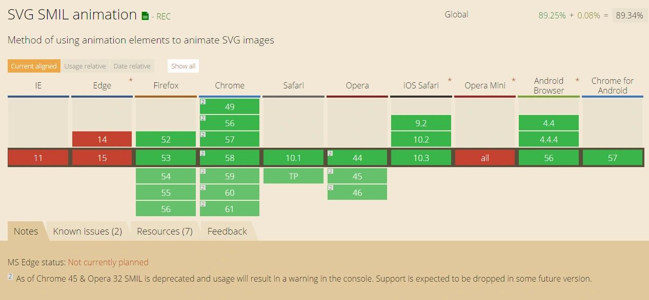
SVG Css AnimationはEdgeとIEでは対応できませんのでJavaScriptやjQueryを使いましょう~
応用
カラー変更して「Z」だけ違うカラーにするとアニメーション「LYZONロゴ」が完成!
今回はCSSだけ使って動きを表現しましたが「Javascript」や「jQuery」を一緒に使うとさらに豊かな動きの表現ができます。
Lyzon編集部
株式会社LYZONの社内ニュースを始め、デザインの知識やお役立ち情報など様々な情報を発信しています。